The Adventures of Sherlock Holmes
The man sprang from his chair and paced up and down the room in uncontrollable agitation. Then, with a gesture of desperation, he tore the mask from his face and hurled it upon the ground. "You are right," he cried; "I am the King. Why should I attempt to conceal it?"
"Why, indeed?" murmured Holmes. "Your Majesty had not spoken before I was aware that I was addressing Wilhelm Gottsreich Sigismond von Ormstein, Grand Duke of Cassel-Felstein, and hereditary King of Bohemia."
"But you can understand," said our strange visitor, sitting down once more and passing his hand over his high white forehead, "you can understand that I am not accustomed to doing such business in my own person. Yet the matter was so delicate that I could not confide it to an agent without putting myself in his power. I have come incognito from Prague for the purpose of consulting you."
"Then, pray consult," said Holmes, shutting his eyes once more.
"The facts are briefly these: Some five years ago, during a lengthy visit to Warsaw, I made the acquaintance of the well-known adventuress, Irene Adler. The name is no doubt familiar to you."
"Kindly look her up in my index, Doctor," murmured Holmes without opening his eyes. For many years he had adopted a system of docketing all paragraphs concerning men and things, so that it was difficult to name a subject or a person on which he could not at once furnish information. In this case I found her biography sandwiched in between that of a Hebrew rabbi and that of a staff-commander who had written a monograph upon the deep-sea fishes.
Image Hover Effect
Hover effects bring interactivity and motion to a design, making for a more dynamic web experience. Whether they indicate an active link or trigger a burst of animation, hover effects give user immediate feedback. They can guide visitors to take a desired action or act as an artistic embellishment that livens up a digital space.
Image hover effects create an opportunity to add interactivity to elements on a website without slowing it down. Hover effects are elegant, they don’t clutter designs, and websites run smoothly no matter how many you add.
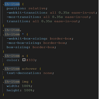
1) I wrote a "div class" to define, give position and also i can give hover effects in css easily.
2)After than I created another "div class" which called "ih-item circle colored effect3 left_to_right" to specify my hover effects inside of this class.
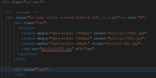
3) I called my picture from file and give them different class name to make my job easier
When i finished defining all the details , I jumped to the CSS to change style of blog and give pictures some effects.
HTML
<div class="row">
<!-- colored -->
<div class="img-hover-container row1 col-xs-12 col-sm-12 col-md-6 col-lg-3">
<div class="ih-item circle colored effect3 left_to_right"><a href="#">
<div class="img"><img src="pic1/a1-320.jpg" alt="img">
</div>
<div class="info">
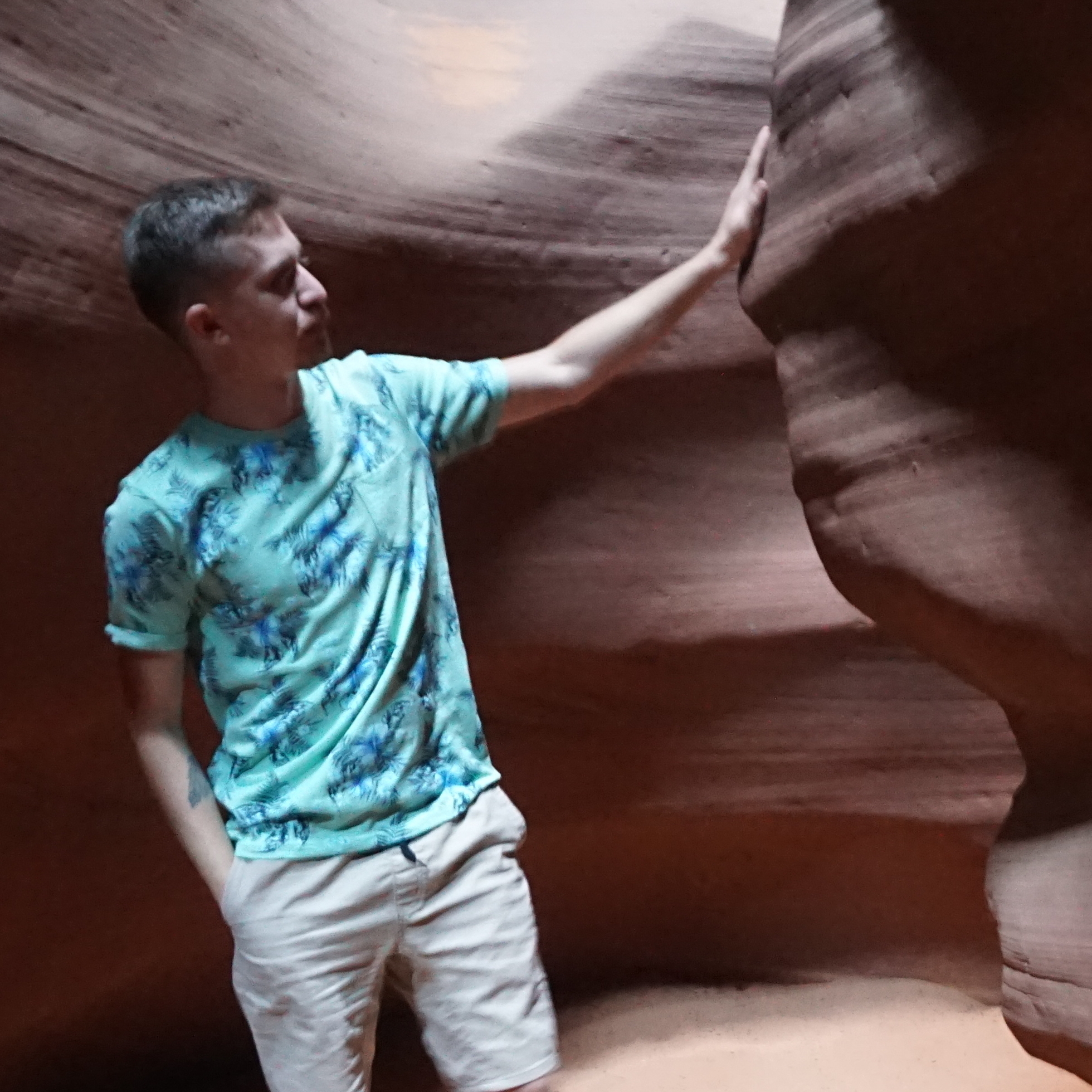
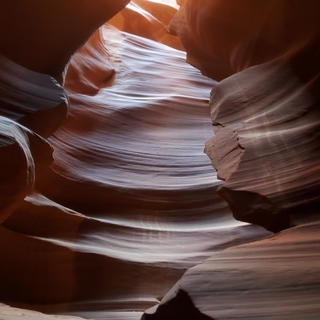
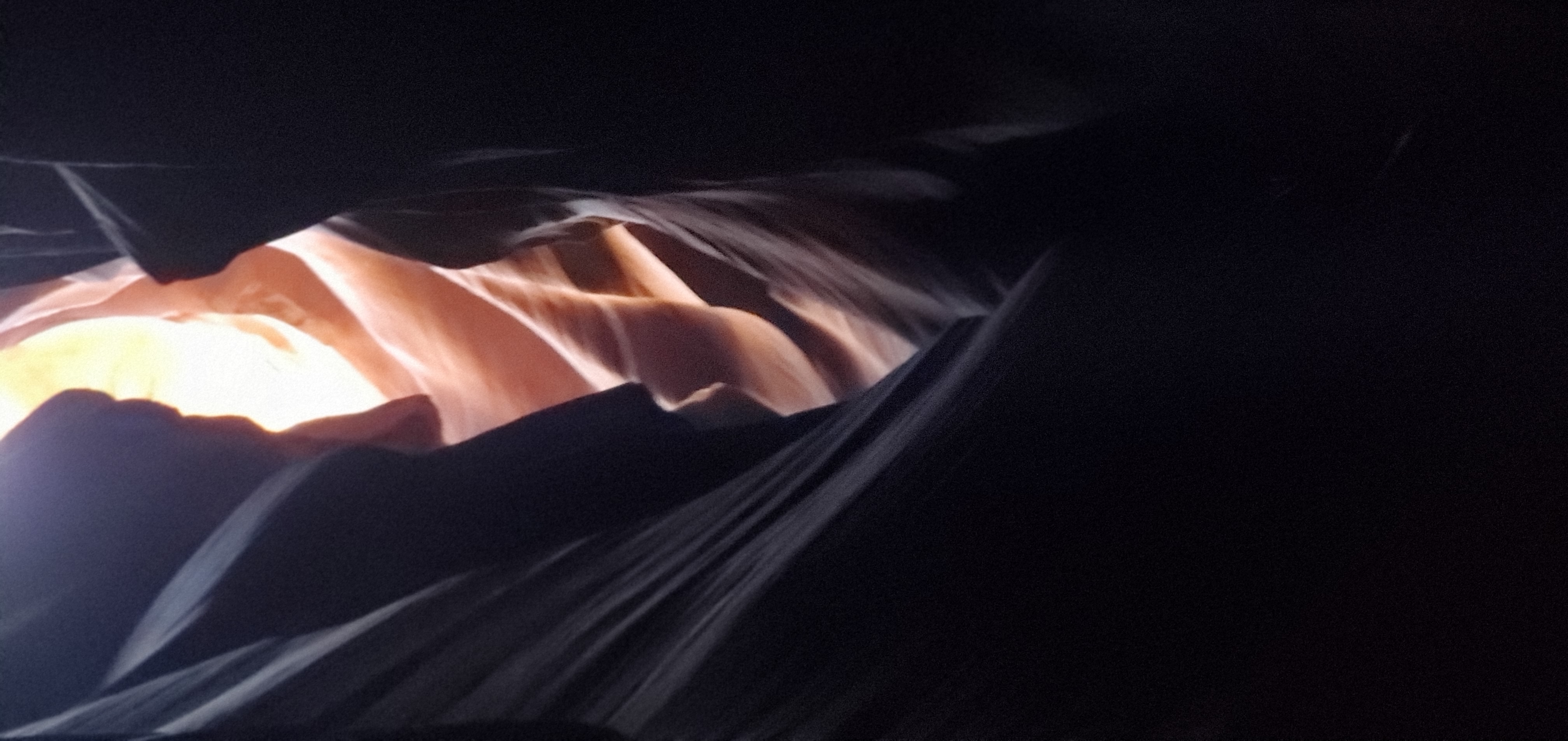
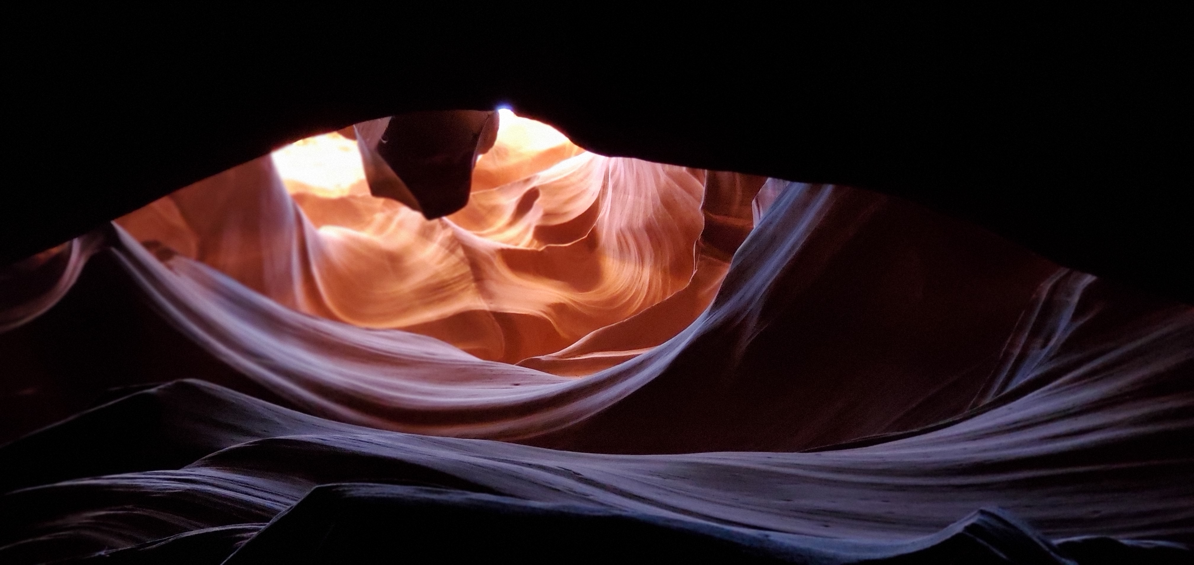
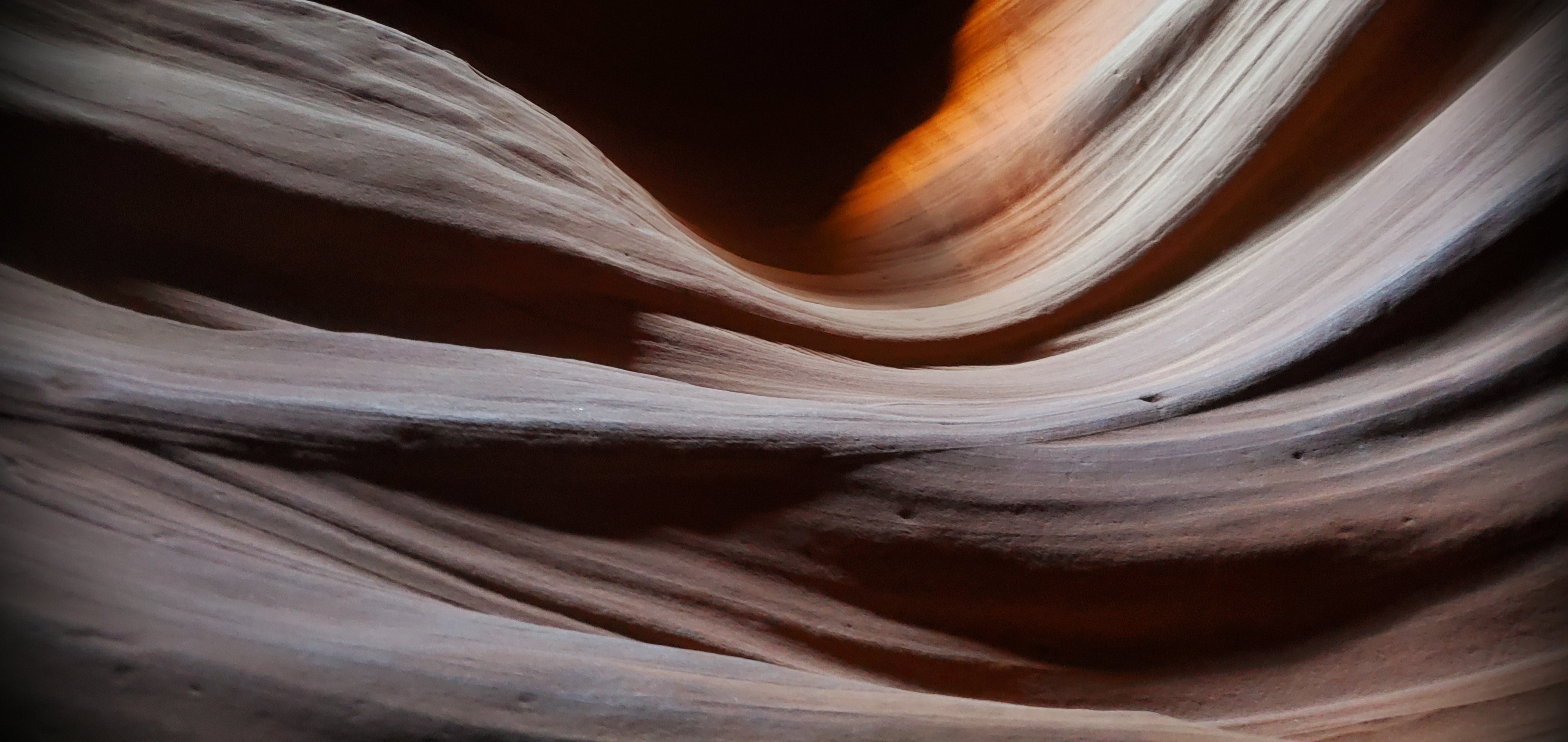
<h3>Antelope Canyon </h3>
<p>Letf To Right</p>
</div>
</a>
</div>
</div>
<div class="img-hover-container row2 col-xs-12 col-sm-12 col-md-6 col-lg-3">
<div class="ih-item circle colored effect3 right_to_left"><a href="#">
<div class="img"><img src="pic1/a2.jpg" alt="img"></div>
<div class="info">
<h3>Arizona</h3>
<p>Righ To Left</p>
</div>
</a>
</div>
</div>
<div class="img-hover-container row3 col-xs-12 col-sm-12 col-md-6 col-lg-3">
<div class="ih-item circle colored effect3 bottom_to_top"><a href="#">
<div class="img">
<img src="pic1/a3.jpg" alt="img"></div>
<div class="info">
<h3>Canyon</h3>
<p>Bottom To Top</p>
</div>
</a>
</div>
</div>
<div class="img-hover-container row4 col-xs-12 col-sm-12 col-md-6 col-lg-3">
<div class="ih-item circle colored effect3 top_to_bottom"><a href="#">
<div class="img"><img src="pic1/a4.jpg" alt="img"></div>
<div class="info">
<h3>Canyon Arizona</h3>
<p>Top To Bottom</p>
</div>
</a>
</div>
</div>
</div>
ihover.css
        .ih-item {
          position: relative;
          -webkit-transition: all 0.35s ease-in-out;
          -moz-transition: all 0.35s ease-in-out;
          transition: all 0.35s ease-in-out;
        }
        .ih-item,
        .ih-item * {
          -webkit-box-sizing: border-box;
          -moz-box-sizing: border-box;
          box-sizing: border-box;
        }
        .ih-item a {
          color: #333;
        }
        .ih-item a:hover {
          text-decoration: none;
        }
        .ih-item img {
          width: 100%;
          height: 100%;
        }

        .ih-item.circle {
          position: relative;
          width: 220px;
          height: 220px;
          border-radius: 50%;
        }
        .ih-item.circle .img {
          position: relative;
          width: 220px;
          height: 220px;
          border-radius: 50%;
        }
        .ih-item.circle .img:before {
          position: absolute;
          display: block;
          content: '';
          width: 100%;
          height: 100%;
          border-radius: 50%;
          box-shadow: inset 0 0 0 16px rgba(255, 255, 255, 0.6),
            0 1px 2px rgba(0, 0, 0, 0.3);
          -webkit-transition: all 0.35s ease-in-out;
          -moz-transition: all 0.35s ease-in-out;
          transition: all 0.35s ease-in-out;
        }
        .ih-item.circle .img img {
          border-radius: 50%;
        }
        .ih-item.circle .info {
          position: absolute;
          top: 0;
          bottom: 0;
          left: 0;
          right: 0;
          text-align: center;
          border-radius: 50%;
          -webkit-backface-visibility: hidden;
          backface-visibility: hidden;
        }
        .ih-item.circle.effect3 .img {
          z-index: 11;
          -webkit-transition: all 0.35s ease-in-out;
          -moz-transition: all 0.35s ease-in-out;
          transition: all 0.35s ease-in-out;
        }
        .ih-item.circle.effect3.colored .info {
          background: #1a4a72;
        }
        .ih-item.circle.effect3 .info {
          background: #333333;
          opacity: 0;
          pointer-events: none;
          -webkit-transition: all 0.35s ease-in-out;
          -moz-transition: all 0.35s ease-in-out;
          transition: all 0.35s ease-in-out;
        }
        .ih-item.circle.effect3 .info h3 {
          color: #fff;
          text-transform: uppercase;
          position: relative;
          letter-spacing: 2px;
          font-size: 22px;
          margin: 0 30px;
          padding: 55px 0 0 0;
          height: 110px;
          text-shadow: 0 0 1px white, 0 1px 2px rgba(0, 0, 0, 0.3);
        }
        .ih-item.circle.effect3 .info p {
          color: #bbb;
          padding: 10px 5px;
          font-style: italic;
          margin: 0 30px;
          font-size: 12px;
          border-top: 1px solid rgba(255, 255, 255, 0.5);
        }

        .ih-item.circle.effect3.left_to_right .img {
          -webkit-transform: scale(1) translateX(0);
          -moz-transform: scale(1) translateX(0);
          -ms-transform: scale(1) translateX(0);
          -o-transform: scale(1) translateX(0);
          transform: scale(1) translateX(0);
        }
        .ih-item.circle.effect3.left_to_right .info {
          -webkit-transform: translateX(-100%);
          -moz-transform: translateX(-100%);
          -ms-transform: translateX(-100%);
          -o-transform: translateX(-100%);
          transform: translateX(-100%);
        }
        .ih-item.circle.effect3.left_to_right a:hover .img {
          -webkit-transform: scale(0.5) translateX(100%);
          -moz-transform: scale(0.5) translateX(100%);
          -ms-transform: scale(0.5) translateX(100%);
          -o-transform: scale(0.5) translateX(100%);
          transform: scale(0.5) translateX(100%);
        }
        .ih-item.circle.effect3.left_to_right a:hover .info {
          opacity: 1;
          -webkit-transform: translateX(0);
          -moz-transform: translateX(0);
          -ms-transform: translateX(0);
          -o-transform: translateX(0);
          transform: translateX(0);
        }

        .ih-item.circle.effect3.right_to_left .img {
          -webkit-transform: scale(1) translateX(0);
          -moz-transform: scale(1) translateX(0);
          -ms-transform: scale(1) translateX(0);
          -o-transform: scale(1) translateX(0);
          transform: scale(1) translateX(0);
        }
        .ih-item.circle.effect3.right_to_left .info {
          -webkit-transform: translateX(100%);
          -moz-transform: translateX(100%);
          -ms-transform: translateX(100%);
          -o-transform: translateX(100%);
          transform: translateX(100%);
        }
        .ih-item.circle.effect3.right_to_left a:hover .img {
          -webkit-transform: scale(0.5) translateX(-100%);
          -moz-transform: scale(0.5) translateX(-100%);
          -ms-transform: scale(0.5) translateX(-100%);
          -o-transform: scale(0.5) translateX(-100%);
          transform: scale(0.5) translateX(-100%);
        }
        .ih-item.circle.effect3.right_to_left a:hover .info {
          opacity: 1;
          -webkit-transform: translateX(0);
          -moz-transform: translateX(0);
          -ms-transform: translateX(0);
          -o-transform: translateX(0);
          transform: translateX(0);
        }

        .ih-item.circle.effect3.top_to_bottom .img {
          -webkit-transform: scale(1) translateY(0);
          -moz-transform: scale(1) translateY(0);
          -ms-transform: scale(1) translateY(0);
          -o-transform: scale(1) translateY(0);
          transform: scale(1) translateY(0);
        }
        .ih-item.circle.effect3.top_to_bottom .info {
          -webkit-transform: translateY(-100%);
          -moz-transform: translateY(-100%);
          -ms-transform: translateY(-100%);
          -o-transform: translateY(-100%);
          transform: translateY(-100%);
        }
        .ih-item.circle.effect3.top_to_bottom a:hover .img {
          -webkit-transform: scale(0.5) translateY(100%);
          -moz-transform: scale(0.5) translateY(100%);
          -ms-transform: scale(0.5) translateY(100%);
          -o-transform: scale(0.5) translateY(100%);
          transform: scale(0.5) translateY(100%);
        }
        .ih-item.circle.effect3.top_to_bottom a:hover .info {
          opacity: 1;
          -webkit-transform: translateY(0);
          -moz-transform: translateY(0);
          -ms-transform: translateY(0);
          -o-transform: translateY(0);
          transform: translateY(0);
        }

        .ih-item.circle.effect3.bottom_to_top .img {
          -webkit-transform: scale(1) translateY(0);
          -moz-transform: scale(1) translateY(0);
          -ms-transform: scale(1) translateY(0);
          -o-transform: scale(1) translateY(0);
          transform: scale(1) translateY(0);
        }
        .ih-item.circle.effect3.bottom_to_top .info {
          -webkit-transform: translateY(100%);
          -moz-transform: translateY(100%);
          -ms-transform: translateY(100%);
          -o-transform: translateY(100%);
          transform: translateY(100%);
        }
        .ih-item.circle.effect3.bottom_to_top a:hover .img {
          -webkit-transform: scale(0.5) translateY(-100%);
          -moz-transform: scale(0.5) translateY(-100%);
          -ms-transform: scale(0.5) translateY(-100%);
          -o-transform: scale(0.5) translateY(-100%);
          transform: scale(0.5) translateY(-100%);
        }
        .ih-item.circle.effect3.bottom_to_top a:hover .info {
          opacity: 1;
          -webkit-transform: translateY(0);
          -moz-transform: translateY(0);
          -ms-transform: translateY(0);
          -o-transform: translateY(0);
          transform: translateY(0);
        }
After completing CSS we should check all the details for our hover because we want them to work well.Lastly, when we finish the effect we should locate the pictures where ever we want and i letf some examples so you can see the result by getting your icon closer to pictures.
I had four different hover effects and which are "left to right", "right to left", "bottom to top" and "top to bottom". I think they are so useful and easy for users to set up on their websites.Cascading Style Sheet(CSS) allows users many options to provide stylish effects.